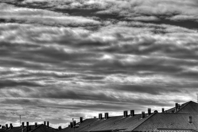
Unlike its color version, this b/w image highlights the wave-like shape of the clouds, and so I prefer this version. At a closer look, the tiles on the roofs seem to align in waves too, thus blending the two parts of the image

Unlike its color version, this b/w image highlights the wave-like shape of the clouds, and so I prefer this version. At a closer look, the tiles on the roofs seem to align in waves too, thus blending the two parts of the image
 To provide the best experiences, we use technologies like cookies to store and/or access device information. Consenting to these technologies will allow us to process data such as browsing behavior or unique IDs on this site. Not consenting or withdrawing consent, may adversely affect certain features and functions.